Quick answer
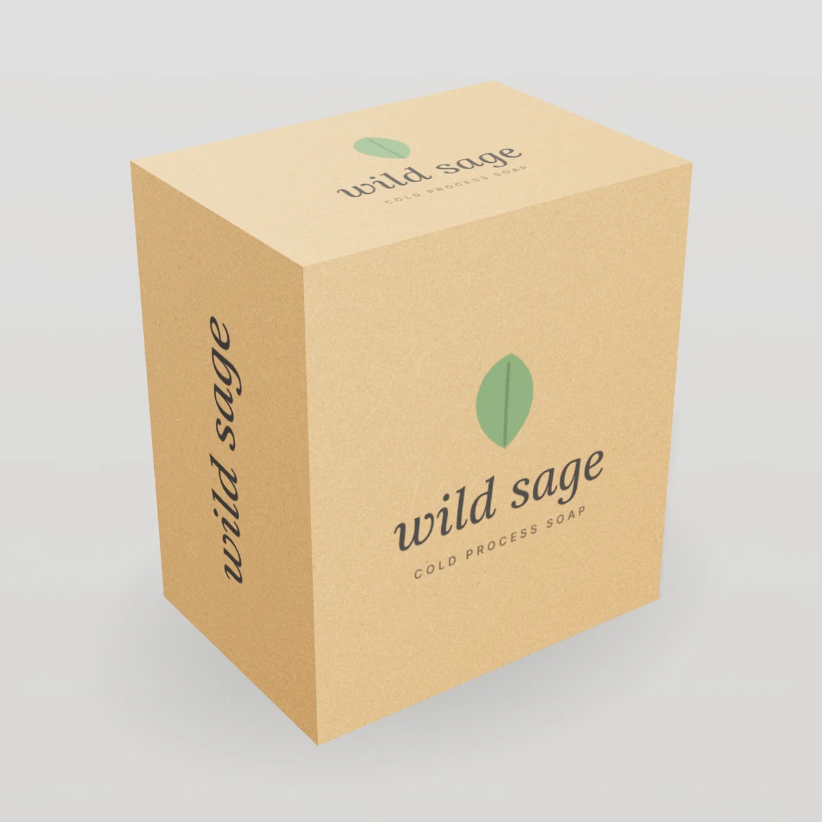
Natural brown, unbleached board with a handmade, eco-forward look. Typical turnaround is 10–14 business days after proof approval.
What is kraft paperboard?
Kraft paperboard is paperboard made from unbleached wood pulp produced by the kraft (sulfate) process. It is the board-weight cousin of kraft paper. Without bleaching, the fibers keep their natural brown color and much of their strength. Kraft board is tough, tear-resistant and has a distinctive natural look that signals honesty, craft and sustainability.
You will see kraft in several forms:
- Uncoated kraft paperboard: brown on both sides, with a slightly textured, natural surface
- Coated unbleached kraft (CUK): a white clay-coated printing surface over a brown kraft back; strong, with good print quality
- Kraft-lined corrugated: corrugated board with brown kraft liners (see corrugated cardboard)
- Kraft papers: used to wrap rigid boxes and tubes, and for bags and tape

Why brands choose kraft
- Natural look and feel that suits organic, handmade, sustainable and artisan brands
- Strength: long unbleached fibers resist tearing and bursting
- Cost: often slightly less expensive than bleached board
- Versatility: works for cartons, mailers, bags, tape and wraps
- Hides scuffs better than white board in shipping
Printing on kraft
Kraft's brown color changes how ink looks:
- Dark inks (black, navy, forest green, burgundy) print beautifully and look rich.
- Light and bright colors look muted, because standard inks are transparent and the brown shows through.
- White ink printed first (on presses that support it) creates a bright base for colors, a striking look on kraft.
- Photography generally looks better on white board or CUK.
| Effect | How to achieve it on kraft |
|---|---|
| Classic natural | One black or dark ink |
| Bold contrast | White ink on kraft |
| Premium | Gold or copper foil, blind emboss |
| Colorful | White ink underlay, or choose CUK |
Tip: Ask for a printed sample if a specific brand color must appear on kraft. Colors shift warmer and darker, and the shift varies by batch of board.
Finishes on kraft
- Foil stamping: gold and copper look stunning on kraft.
- Blind embossing: adds texture with no ink.
- Spot UV: possible on coated kraft; less effective on uncoated.
- Windows: open windows keep the box all-paper.

Kraft vs. SBS vs. recycled board
| Kraft / CUK | SBS | CRB (recycled) | |
|---|---|---|---|
| Color | Natural brown | Bright white | White face, grey back |
| Strength | Very high | High | Moderate |
| Good (dark inks) | Excellent | Very good | |
| Look | Natural, artisan | Premium, clean | Everyday |
| Cost | Medium | Higher | Lower |
Kraft for sustainability-focused brands
Kraft paperboard is made from renewable fiber, often with less chemical processing than bleached board, and is widely recyclable. It visually communicates a natural, eco-friendly message. To make environmental claims, be specific: "made with recycled content" requires recycled fiber; "recyclable" should reflect local recycling access; FSC claims require certified board and a license. See our sustainable packaging guide.
Where the word "kraft" comes from
"Kraft" is German and Swedish for "strength". The kraft pulping process, developed in the late nineteenth century, cooks wood chips in a solution of sodium hydroxide and sodium sulfide. It removes lignin while leaving long, strong cellulose fibers intact, and the chemicals are recovered and reused in the mill. Today kraft pulping is the dominant way wood is turned into paper fiber worldwide. When the pulp is not bleached, it keeps the warm brown color that customers recognize instantly as kraft.
Kraft materials compared
Kraft shows up across almost every packaging format. Knowing which kind you are buying avoids surprises in color, strength and print.
| Material | Construction | Typical caliper or weight | Best for |
|---|---|---|---|
| Uncoated kraft paperboard | Unbleached fiber, brown both sides | 14–24pt | Rustic cartons, tags, sleeves |
| CUK (coated unbleached kraft) | Brown kraft with white clay coating on the print side | 16–28pt | Strong cartons with good print, beverage carriers |
| Kraft corrugated | Kraft liners and medium | E-, B- and C-flute | Mailers, shipping boxes |
| Kraft wrap paper | Kraft paper laminated over greyboard | 100–157 gsm wraps | Rigid boxes, tubes |
| Kraft bag paper | Strong sack or bag kraft | 50–120 gsm | Shopping bags, paper mailers |
| Kraft paper tape | Kraft paper with water-activated adhesive | Rolls | Sealing corrugated boxes |
| Kraft/PE film laminate | Kraft paper outer with plastic inner layers | Laminate | Stand-up pouches |
The "kraft" look can therefore be paired across a whole packaging system: a kraft mailer, kraft tissue alternatives, kraft tape and kraft cards. That consistency is a strong brand signal.
Uncoated kraft vs. CUK
Many brands ask for "kraft boxes" but would be happier with CUK, or the other way round.
| Question | Uncoated kraft | CUK |
|---|---|---|
| Is the outside brown? | Yes | No: the print side is white-coated, the inside is brown |
| How do colors look? | Muted and warm; best with dark inks | Bright and accurate, like white board |
| Does it feel natural? | Yes, slightly textured | Smooth on the print side |
| Strength | High | Very high |
| Typical use | Artisan, natural, minimal brands | Retail cartons needing strength and color |
If you want the natural brown look outside, choose uncoated kraft or kraft corrugated. If you want vivid full-color printing with extra strength, choose CUK or SBS. Some brands combine both: a kraft outer mailer with a brightly printed CUK or SBS carton inside.
Designing for kraft
Kraft rewards confident, simple design. A few principles we share with every brand designing on kraft:
- Embrace the brown. Let the board be part of the palette rather than fighting it with heavy coverage.
- Use one or two dark inks. Black, deep navy, forest green, oxblood and chocolate brown look rich and crisp.
- Use white ink for contrast. Where presses support it, a white ink layer creates bright highlights or an underlay for color.
- Increase line weights. Uncoated kraft absorbs ink and spreads it slightly (dot gain). Avoid hairlines and very small type, especially reversed.
- Go big with the logo. Bold marks read well on kraft from a distance.
- Add one premium touch. Gold or copper foil, or a blind emboss, elevates kraft dramatically.
- Mock it up on kraft. Preview designs on a kraft background; our 3D Box Builder can show your design on kraft board.
How colors shift on kraft
Standard process inks are transparent, so the brown shows through. In practice:
| Intended color | How it looks on uncoated kraft |
|---|---|
| Black | Deep, slightly warm black |
| Navy / dark blue | Rich, slightly darker |
| Red | Brick or rust red |
| Bright yellow | Mustard or olive tint |
| Pastel pink | Barely visible |
| White (without white ink) | Not printable: white is the absence of ink |
| Photographs | Dark and low contrast |
For any color-critical element, ask for a printed sample or a drawdown on the actual board.
Kraft for different industries
| Industry | How kraft is used |
|---|---|
| Food and bakery | Kraft cartons and gable boxes with food-safe linings where needed |
| Coffee and tea | Kraft cartons and kraft-look stand-up pouches |
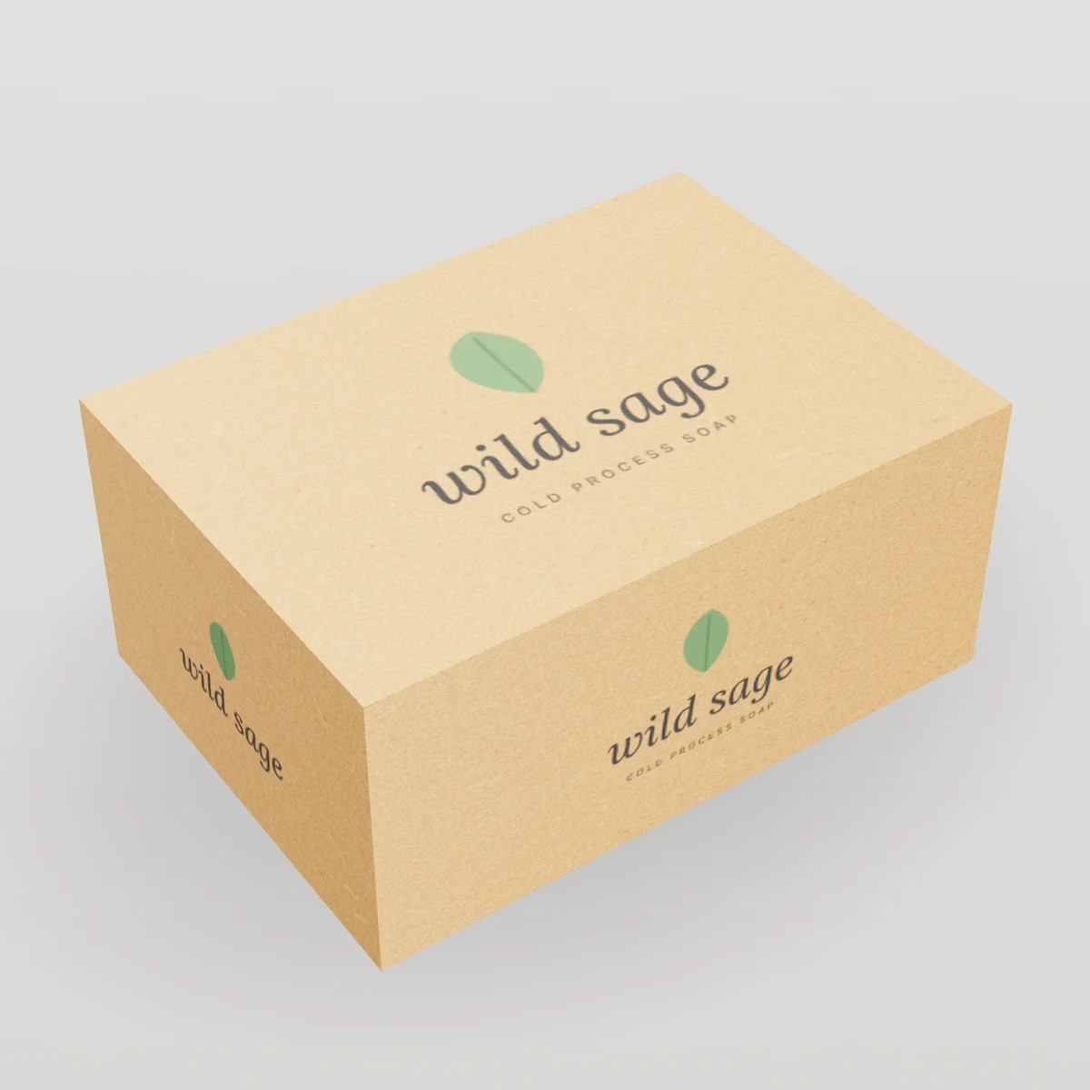
| Soap and bath | Kraft sleeves, tuck cartons and pillow boxes |
| Candles | Kraft mailers and cartons with foil logos |
| Apparel | Kraft mailers with one-color logos; kraft hang tags |
| CBD and wellness | Kraft cartons signalling natural ingredients |
| Gift boxes | Kraft-wrapped rigid boxes and tubes |
Kraft for sustainability-minded packaging
Kraft's unbleached fiber skips the bleaching stage, and kraft board is accepted in curbside recycling programs across the US. Kraft corrugated typically contains recycled content. That said, color alone does not make packaging more sustainable: right-sizing, using one material family, avoiding unnecessary plastic, and making accurate claims matter more. Avoid implying that "brown means eco-friendly" on your packaging; describe what is actually true, such as "Made from paperboard. Please recycle."
See our sustainable packaging guide for how to word claims under the FTC Green Guides.
Finishes that work best on kraft
| Finish | Result on kraft | Recommendation |
|---|---|---|
| Gold, copper or rose gold foil | Warm, premium contrast | Highly recommended |
| Black or holographic foil | Bold, modern | Good for youthful brands |
| Blind emboss / deboss | Tactile, ink-free | Excellent; keep shapes bold |
| White ink | Bright contrast | Ask about press capability |
| Spot UV | Subtle on uncoated kraft | Better on CUK |
| Gloss lamination | Changes the natural look | Rarely recommended |
| Window | Shows product | Open windows keep it all-paper |
Specification checklist for kraft packaging
- [ ] Format: carton (uncoated kraft or CUK), mailer (kraft corrugated), rigid (kraft wrap), pouch (kraft laminate)
- [ ] Inside dimensions and product weight
- [ ] Caliper or flute
- [ ] Ink colors: dark inks, white ink, or full color on CUK
- [ ] Finishes: foil color, emboss
- [ ] Food contact: yes or no
- [ ] Quantity and reorder frequency
Worked example: a handmade soap brand
A soap maker sells 4 oz bars and wants a natural look with a premium touch.
- Structure: a kraft sleeve or tuck carton sized to the bar with 1/16 in clearance.
- Board: 18pt uncoated kraft paperboard.
- Print: one black ink for brand, scent name and required information.
- Finish: a copper foil logo on the front.
- Ventilation: small die-cut holes or an open window so the scent comes through and the soap can breathe.
- Labeling: ingredients and net weight on the back panel (see the labeling guide).
The result is a natural, giftable carton at a modest unit price, especially at 1,000 units or more.
Common mistakes with kraft packaging
- Expecting bright colors on uncoated kraft without white ink.
- Using thin fonts or hairlines that fill in on absorbent kraft.
- Covering kraft entirely with ink, which hides the material you paid for and can look muddy.
- Approving color on a screen instead of a printed sample.
- Assuming all kraft looks the same. Shades vary between mills and batches, from light tan to deep brown.
Caliper guide for kraft cartons
Kraft fibers are strong, so kraft cartons can sometimes use a slightly lower caliper than bleached board for the same stiffness. Typical starting points:
| Product | Carton size | Suggested kraft caliper |
|---|---|---|
| Soap bars, tea sachets, small accessories | Under 4 in | 16–18pt |
| Candles in tins, cosmetics jars | 3–5 in | 18pt |
| Candles in glass, coffee bags in cartons | 4–7 in | 20pt |
| Gift sets, heavier jars | 6–10 in | 24pt or E-flute kraft corrugated |
| Products over about 2 lb | Any | Kraft corrugated mailer or carton |
For anything that ships alone through a parcel carrier, use kraft corrugated rather than paperboard.
How kraft packaging is printed
| Process | Works on kraft? | Notes |
|---|---|---|
| Flexo | Yes, very common on kraft corrugated | Ideal for one- or two-color logos on mailers and shipping boxes |
| Offset | Yes, on uncoated kraft and CUK | Good detail on CUK; uncoated kraft absorbs more ink |
| Digital inkjet | Yes | Full color and white ink on some presses; great for short runs |
| Screen printing | Yes | Opaque white and metallic inks on bags and specialty items |
| Hot foil stamping | Yes | Gold and copper are classics on kraft |
Because uncoated kraft absorbs ink, printers compensate for dot gain (dots spreading). Designs with fine halftones and photography lose contrast; flat shapes, bold type and line illustrations reproduce best.
The kraft packaging system
The strongest kraft brands use kraft consistently across every touchpoint:
- Outer: kraft mailer box or shipping box with a one-color logo
- Seal: kraft packing tape, water-activated for a clean paper finish
- Inner: kraft carton or sleeve for each product
- Wrap: printed tissue paper or kraft crinkle paper
- Message: a kraft thank-you card or hang tag
- Retail: kraft paper bags for in-person sales
Keeping materials in one paper family also makes the whole package easy for customers to recycle together.
Kraft vs. white: which sells better?
There is no universal answer. Kraft signals natural, handmade, honest and environmentally minded; white signals clean, clinical, premium or playful depending on the design. Consider:
- Your category's cues. Kraft is expected in artisan food, natural skincare and craft goods; white is expected in clinical skincare and electronics.
- Your differentiation. In a sea of white cartons, kraft stands out, and the reverse is true too.
- Your colors. If your brand depends on a bright or pastel color, white board (or CUK) reproduces it faithfully.
- Your price point. Kraft with foil can look very premium; kraft with heavy full-color print can look muddy.
When in doubt, order a sample kit and compare both with your artwork mocked up.
Moisture, grease and food
Kraft board is absorbent. For food and humid environments:
- Use food-contact grades when food touches the board.
- Add grease-resistant treatments or liners for oily foods.
- Choose barrier coatings or an inner bag for moisture-sensitive products such as coffee.
- Store flat cartons in a dry place to avoid warping.
Cost of kraft packaging
Kraft board itself is usually priced similar to or slightly below bleached board, and kraft designs often use fewer inks, which reduces cost further. A one-color kraft mailer is one of the most economical branded boxes available. The price table on this page shows estimates for every style we make in kraft.
Virgin kraft vs. recycled kraft
Kraft board and paper can be made from virgin unbleached fiber, recycled fiber, or a blend.
| Virgin kraft | Recycled kraft (test liner, recycled board) | |
|---|---|---|
| Fiber | Long, fresh fibers | Shorter recovered fibers |
| Strength | Highest | Good; heavier weights may be needed |
| Color | Even, warm brown | Can be greyer or more variable |
| Surface | Smoother | More speckled; small visible flecks are normal |
| Claims | Certified forest sourcing possible | Recycled-content claims possible when substantiated |
Corrugated kraft liners in North America are often a blend. If a recycled-content claim matters to your brand, ask for a specific grade with documented recycled content before you print the claim.
Kraft in e-commerce
Kraft corrugated mailers are a favorite for direct-to-consumer brands because:
- They hide scuffs. Brown board shows less dirt and abrasion from parcel networks than bright white.
- They print well with one color. A bold black or white logo on kraft is economical and recognizable.
- They feel considered. Customers associate kraft with thoughtful, lower-impact packaging, provided the rest of the package matches (paper tape, paper fill, no plastic overload).
- They pair with a printed interior. A kraft outside with a bright printed inside creates a strong reveal.
For heavier products, choose B-flute kraft; for standard cartons, C-flute kraft 32 ECT. See corrugated cardboard for grades.
Briefing a designer for kraft packaging
Share this brief with your designer to avoid surprises:
- Board: "Uncoated kraft paperboard, 18pt" or "E-flute kraft corrugated" (or CUK if full color is needed).
- Ink limits: "One or two dark inks, plus optional white ink" or "Full color on CUK".
- Minimum line weight: 0.5 pt positive, 0.75 pt reversed on uncoated kraft.
- Minimum type size: 7 pt for body copy on uncoated kraft, larger for reversed text.
- Finish layers: foil and emboss on separate layers, 100% spot color.
- Mockups: show designs on a kraft texture, not on white.
- Dieline: use the production dieline we provide for your size.
Our artwork guidelines cover file setup in more detail.
Requesting kraft samples
Kraft shades vary, so samples are especially useful:
- Ask for a board swatch to see the actual shade and texture.
- For color-critical brands, request a printed sample or ink drawdown on the board.
- Compare foil colors on kraft side by side; gold looks different on light and dark kraft.
- Check fold quality on darker inks.
Our sample kit includes kraft and white board swatches with several finishes.
Kraft terms you'll hear
- Unbleached: fiber that keeps its natural color.
- CUK: coated unbleached kraft, brown board with a white coated print surface.
- Test liner: linerboard made mainly from recycled fiber.
- Virgin kraft liner: linerboard made mainly from fresh unbleached fiber.
- Dot gain: ink spreading on absorbent stock, which darkens halftones.
- Drawdown: an ink sample spread on the actual board to preview color.
- White ink underlay: a white layer printed under colors on brown or clear materials.
See the glossary for more.
Kraft in one paragraph
Kraft is strong, unbleached board with a natural brown look. Use uncoated kraft or kraft corrugated when you want the brown to be part of your brand, with one or two dark inks, a gold or copper foil and bold design. Use CUK or white board when your brand depends on bright or accurate color. Keep the whole package in one paper family for a consistent look and easy recycling, and make specific, accurate environmental claims.
Kraft packaging ideas by product
| Product | Kraft packaging idea |
|---|---|
| Candles in tins | Uncoated kraft tuck carton, black ink, copper foil logo |
| Glass candles | Kraft E-flute mailer with a kraft corrugated insert and one-color inside print |
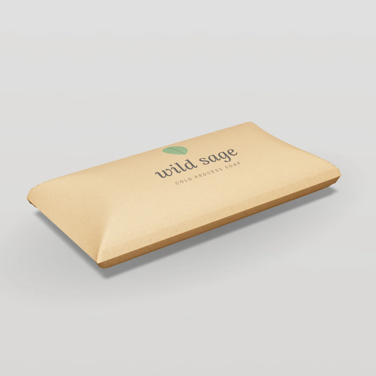
| Handmade soap | Kraft paper band or sleeve with a die-cut window to show the bar |
| Coffee beans | Kraft-look stand-up pouch with valve, inside a kraft mailer for shipping |
| Tea | Kraft tube with a printed paper label and copper foil |
| Jewelry | Kraft pillow box or small two-piece box with gold foil |
| Apparel | Kraft mailer with white-ink logo and printed tissue |
| Baked goods | Kraft gable box with grease-resistant lining and a window |
| Gift sets | Kraft-wrapped rigid box with blind deboss and a paper insert |
| Plants and seeds | Kraft cartons and envelopes with earthy two-color print |
How kraft looks in photos
Kraft photographs warmly and naturally, which suits lifestyle imagery. To make it look its best:
- Shoot in soft daylight, which keeps the brown warm without turning orange.
- Pair with natural props (linen, wood, greenery) to reinforce the material story.
- Show texture up close, especially blind embossing and foil.
- Keep white balance consistent across product photos so kraft does not shift from tan to grey between images.
- Contrast with color inside: a bright printed interior photographs dramatically against a kraft exterior.
Kraft and retail shelves
In stores, kraft stands out among glossy white cartons, but it needs strong design to be legible from a distance:
- Use bold, dark type for brand and product names.
- Keep the front panel simple: one logo, one product name, one benefit.
- Use color-coded labels or foil to separate variants on a kraft line.
- Check barcodes carefully; scanners need strong contrast, so print bars in black on a light area (a white ink patch on kraft if needed).
Why kraft resonates with customers
Kraft's appeal is partly visual and partly cultural. The warm brown fiber looks honest and unprocessed, a visible sign that the package is made from paper. It recalls hand-tied parcels, market stalls and workshops, which is why artisan food producers, natural skincare makers and craft brands adopted it early. Over time kraft has become a broad shorthand for "made with care" and "less is more".
That shorthand is powerful, but it is not automatic. A kraft box covered in heavy full-color print loses the natural feel that made kraft attractive, and a kraft box with vague green claims can invite skepticism. The brands that use kraft best let the material show, keep graphics confident and simple, add one tactile or metallic detail, and back the look with real choices: right-sized boxes, paper inserts instead of foam, paper tape instead of plastic, and specific, accurate claims about what the packaging is made from and how to recycle it.
Kraft also has a practical advantage that customers rarely notice but operations teams appreciate: brown board hides scuffs, dirt and small marks from shipping and handling far better than bright white. For e-commerce brands whose boxes travel through parcel networks, that durability of appearance is a quiet but real benefit.
More kraft FAQ
Can kraft packaging be printed in white?
Yes. White ink on kraft is possible with some printing methods and gives a striking, natural look.
Products made with kraft
 IndustriesCandle BoxesJar and tin candle packaging with inserts that protect glass in transit.
 IndustriesSoap BoxesKraft and printed boxes, sleeves and pillow packs for bar soap and bath products.
 Box StylesTuck End BoxesStraight and reverse tuck end cartons that open and reclose cleanly. Ideal for lightweight retail products.
 Box StylesPillow BoxesCurved, self-closing boxes for small gifts, favors, accessories and samples.
Kraft Paperboard prices by box style
Estimated unit prices for each box style we make in this material, at its most popular size with full-color print, delivered within the contiguous US. Use them to compare structures before you request a quote.
| Box style | Material grade | 500 units | 1,000 units | 5,000 units |
|---|---|---|---|---|
| Mailer Boxes9 × 6 × 3" | E-flute corrugated, kraft | $1.27 | $1.00 | $0.73 |
| Shipping Boxes12 × 10 × 6" | E-flute corrugated, kraft | $1.54 | $1.27 | $0.97 |
| Product Boxes4 × 4 × 4" | Kraft paperboard (18pt CUK) | $0.68 | $0.48 | $0.29 |
| Folding Cartons3 × 3 × 5" | Kraft paperboard (18pt CUK) | $0.61 | $0.41 | $0.23 |
| Tuck End Boxes4 × 2 × 6" | Kraft paperboard (18pt CUK) | $0.59 | $0.40 | $0.22 |
| Auto-Lock Bottom Boxes5 × 3 × 7" | Kraft paperboard (18pt CUK) | $0.77 | $0.54 | $0.33 |
| Sleeve Boxes6 × 4 × 2" | Kraft paperboard (18pt CUK) | $0.90 | $0.66 | $0.44 |
| Pillow Boxes6 × 3 × 1.5" | Kraft paperboard (18pt CUK) | $0.47 | $0.31 | $0.17 |
| Gable Boxes6 × 4 × 5" | Kraft paperboard (18pt CUK) | $0.93 | $0.69 | $0.46 |
| Gable Boxes6 × 4 × 5" | E-flute corrugated, kraft | $1.03 | $0.78 | $0.54 |
| Display Boxes10 × 7 × 4" | E-flute corrugated, kraft | $1.37 | $1.08 | $0.79 |
| Window Boxes5 × 3 × 5" | Kraft paperboard (18pt CUK) | $0.89 | $0.62 | $0.38 |
| Hanger Boxes4 × 1.5 × 6" | Kraft paperboard (18pt CUK) | $0.61 | $0.40 | $0.22 |
| Stand-Up Pouches6 × 3.5 × 9" | Kraft paper / PE pouch | $0.76 | $0.49 | $0.26 |
A dash means 500 units is below that style’s minimum order. Your quote confirms exact prices.
How to order kraft paperboard
- 1Request a quote
Tell us the style, size, quantity and artwork you have. Use the form or the live estimator.
- 2Free design & dieline
We send a dieline for your exact size, check your artwork and help with layout at no charge.
- 3Approve your proof
Review a digital 3D proof (and an optional physical sample) before anything is printed.
- 4Production & QC
Your boxes are printed, finished, die-cut and inspected against the approved proof.
- 5Delivered to your door
Shipped flat-packed with tracking to any address in the contiguous US.
Key terms on this page
- Kraft
- Paper or board made from unbleached wood pulp, naturally brown and strong.
- Paperboard
- Thick paper (usually 0.010 inch or more) used for folding cartons, such as SBS, kraft and recycled board.
- Board
- A general term for thick paper materials used in packaging, including paperboard, corrugated board and greyboard.
- CUK
- Coated unbleached kraft paperboard: a strong brown board with a white clay-coated printing surface.
- Corrugated board
- Board made of a fluted (wavy) paper medium glued between flat liners. It is strong, light and the main material for shipping boxes and mailers.
- Wrap
- The printed or specialty paper glued around the board of a rigid box or tube.
- Blind emboss
- An embossed design with no ink or foil, relying only on raised texture and shadow.
- Foil stamping
- Applying metallic or pigmented foil to packaging with heat and pressure using a metal die.
- Embossing
- Raising part of the board surface into a relief using matched dies, often combined with foil or ink.
- Spot UV
- A clear, glossy UV-cured varnish applied to selected areas to create contrast with a matte background.
- SBS (solid bleached sulfate)
- Premium paperboard made from bleached virgin fiber, bright white throughout, with the best print and finish quality.
- Coated recycled board (CRB)
- Paperboard made from recycled fiber with a white clay-coated printing face and a grey back. Economical and widely used for food and household cartons.
- FSC
- The Forest Stewardship Council, an organization that certifies responsible forest management and chain of custody for paper products. Using its label requires certified supply.
- Caliper
- The thickness of paper or board. Paperboard caliper is usually given in points, where 1 point equals 0.001 inch.
- C-flute
- A corrugated flute about 5/32 inch thick and the most common flute for standard shipping cartons, balancing cushioning, stacking strength and cost.
- Greyboard
- Thick, dense recycled board used as the structural core of rigid boxes, usually 1.2 to 3 mm thick.
- Carton
- A box made from paperboard, usually a folding carton. In shipping, "carton" can also mean a corrugated case.
- Coverage
- The proportion of a surface covered by ink. Heavy coverage uses more ink and can affect drying and cracking.
- Dot gain
- The tendency of printed dots to spread on paper, making images darker than the digital file. Printers compensate for it in prepress.
- Right-sizing
- Designing packaging to fit products closely, reducing material, void fill and shipping costs.
- Finish
- Any treatment applied after printing to change appearance or protect the surface, such as coatings, laminations, foil, embossing or spot UV.
- Lamination
- Bonding a thin film (matte, gloss or soft-touch) or paper to board for protection and finish.
- Inside dimensions
- The usable space inside a box, the standard way to specify custom box sizes (L × W × H).
- Flute
- The wavy middle layer of corrugated board. Flute size (A, B, C, E, F) determines thickness, cushioning and strength.
- Sleeve
- An open-ended band or tube that slides over a tray or box, often printed to brand plain packaging.
- Panel
- A face of a box, such as the front, back, side, top or bottom panel.
- E-flute
- A thin corrugated flute about 1/16 inch thick. It prints sharply and folds crisply, making it the standard for mailer boxes.
- Flexographic printing (flexo)
- A printing method using flexible relief plates and fast-drying inks, common on corrugated boxes, labels and flexible packaging.
More definitions in our packaging glossary.
Customer reviews
Reviews come only from verified customers. Ordered kraft paperboard from us? Share your experience.
Discussed on Quora & X
Kraft Paperboard FAQ
What is kraft paperboard?
Paperboard made from unbleached pulp, naturally brown, strong and tear-resistant.
Can you print colors on kraft?
Yes. Dark colors print best. Light colors look muted unless a white ink base is printed first or a coated kraft (CUK) board is used.
Is kraft paperboard recyclable?
Yes. Kraft paperboard is widely recyclable in US curbside programs.
Is kraft more eco-friendly than white board?
Kraft avoids bleaching and is very strong, which can allow lighter board. Overall impact depends on fiber source, recycled content and transport; right-sizing matters most.
What is CUK?
Coated unbleached kraft: a strong kraft board with a white clay-coated printing surface.
Why does kraft vary in color?
Kraft is unbleached, so its shade depends on the wood species, pulping and the share of recycled fiber. Batches can vary from light tan to deep brown.
Can I get full-color printing on kraft?
Yes, on CUK (coated unbleached kraft), which has a white printing surface, or with a white ink underlay on uncoated kraft. Colors on uncoated kraft without white ink look muted.
Is kraft stronger than white board?
Unbleached kraft fibers are long and strong, so kraft and CUK boards are typically very tear- and burst-resistant for their weight.
Is kraft food safe?
Food-contact grades of kraft board and paper are available. Tell us if food will touch the packaging directly so we specify suitable materials and coatings.
Does kraft packaging cost less than white?
Often slightly, especially because kraft designs tend to use fewer ink colors. The difference depends on the style and quantity; compare both in the price table or calculator.
Can kraft boxes have printing inside?
Yes. Kraft corrugated and kraft paperboard can be printed inside, usually with one or two dark inks for best contrast.
What foil color looks best on kraft?
Gold, copper and rose gold give a warm premium contrast. Black and holographic foils create a modern look.
Are speckles in kraft board a defect?
No. Small flecks and shade variation are natural in kraft, especially with recycled fiber. If you need a very even shade, ask for a virgin kraft grade or CUK.
Can I print white on kraft?
Yes, with white ink on presses that support it, or with screen printing on some formats. Without white ink, white areas simply show the brown board.
Can barcodes be printed on kraft?
Yes, in black ink with enough contrast. On darker kraft, print the barcode on a white ink patch or a label so scanners read it reliably.
Does kraft packaging feel cheap?
Not when designed well. Bold typography, good structure and a premium accent such as foil or embossing make kraft feel considered and premium.
Can kraft boxes have a glossy finish?
Yes, with gloss coatings or laminations, though many brands prefer the natural matte look of kraft.